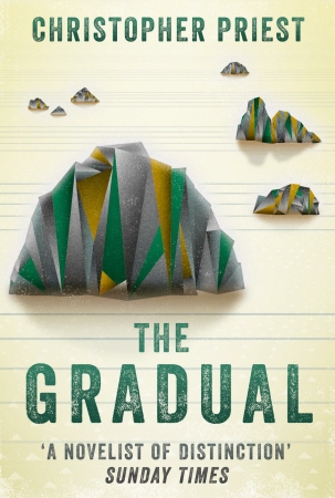
 Same book, same publication date (September 2016), two different approaches. The one at top is Gollancz’s UK edition; the other is Titan’s edition for the USA. I have been waiting a long time for the Gollancz cover to be finalized, partly my fault because at first I said I liked the original draft, then changed my mind. I was away travelling for much of May, and assumed things would happen while I was away. At last, mid-June, I think these two are now the ones.
The choice of cover illustrations is often a vexing one for the writer — at least I find it so. I am not bereft 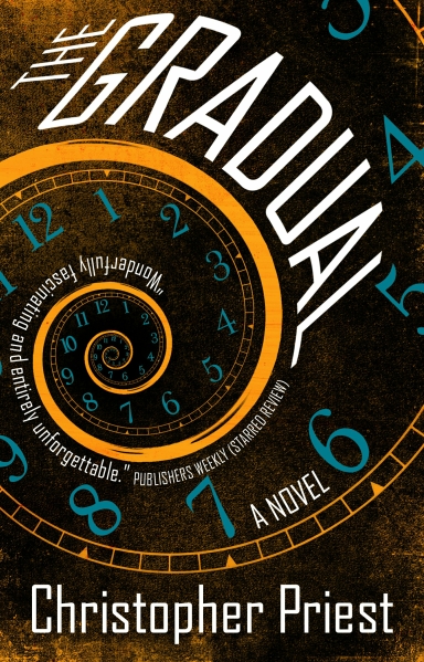 of visual imagination, but whenever I try to reconceive something I have written in visual terms I find myself irresistibly drawn to the mental images I formed when actually writing. As these are usually imprecise as to detail (they are a kind of imagined soupy mix of ideas and characters) they are not much help.
This is of course why publishers have art departments, who supposedly regard the work with fresh eyes, and commission images from that position.
I have always rather liked the traditional paper-wrapped books they use to publish in France: a kind of grey or beige or off-white, with just the title and the author’s name. Whenever I tentatively raise this idea, the publishers clearly think I’m a bit mad.