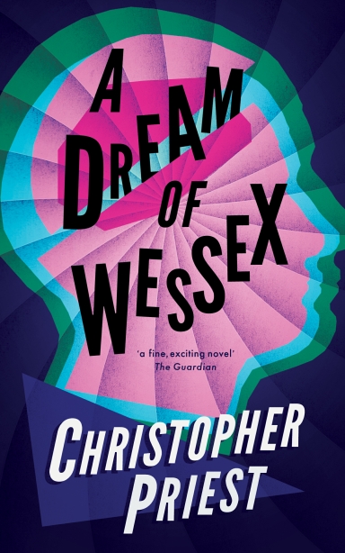
 This is the cover for Valancourt’s new paperback edition of A Dream of Wessex, which they will be publishing in the USA in March.
It is good to see the novel published under its real title at last — when it came out the first time the American publisher (Scribner) changed it to The Perfect Lover. This was partly my own fault — my choice of earlier titles in the USA had turned out to be contentious and I reacted wrongly to that. Two of the titles I had put on my earlier books had led to changes in the USA. Harper & Row changed Fugue for a Darkening Island to Darkening Island, then Inverted World to The Inverted World. Although both these decisions were only slightly mystifying, and the changes only seemingly minor, they led inevitably to confusion in databases and catalogues. I was already fed up with the argument I had to have with the publisher every time (I won two of the arguments: Indoctrinaire and The Space Machine went out in the US with the correct titles), and later I was also fed up with explaining what the difference was to bibliographers, librarians, and so on. It went on for years.
When I completed A Dream of Wessex my then literary agent said that no one outside the UK would have the faintest idea what the word ‘Wessex’ meant, and he proposed a title change. He eventually suggested Future Perfect, which seemed OK for a time — the manuscript went out under that title. Then the British publisher, Faber & Faber, said: ‘No, this is no good.’ They preferred the original! A familiar problem immediately returned, this time in reverse. But to my irritation, even the concession about not alarming American readers by mentioning ‘Wessex’ led to a new argument about the title. Scribner wanted a harmlessly bland formulation, and their change soon seemed not only inevitable but by this time, for me, it was habitual and traditional. The phrase ‘the perfect lover’ is actually used in the novel, but it’s a passing remark — no more than that, a momentary insight, a reflection by one of the characters.
Valancourt’s smart new edition will, I hope, put an end to all that. There is a selection here of the reviews of the original Faber edition — this includes an image of the Faber cover, which is, incidentally, based on a little-known watercolour by the painter Paul Nash.
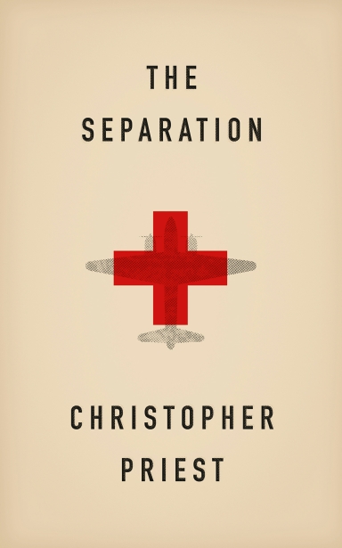 Meanwhile, here is the cover illustration Valancourt have put on their US paperback edition of my 2002 novel The Separation. This was published back in June 2015, but for some reason the copies Valancourt sent to me did not reach me. I only became aware recently that the book was already out. Until now, or at least until June last year, The Separation had never achieved a mass-market paperback in the USA, so this new release is especially pleasing to me.
The Separation is a novel set during WW2, but it’s the part of WW2 that I have always found interesting: the period when Britain ‘stood alone’, when the world war was actually a European war (but no less serious for that), a time when the USA, the USSR and Japan were not yet involved. After June 1941, when Nazi Germany invaded Russia, it became a worldwide conflagration, more deadly and damaging, a grim conflict with consequences for everyone on the planet. My novel is anti-war in intent.
Here are some of the reviews of The Separation, when first published in hardcover, in the UK and the USA.